Car VX Logo Upgrade
Rapid logo revamp for vehicle history report provider
→ What is it about
This task was part of a larger project of creating a new Vehicle History Reports web service for my long-time clients. The company's logo was in desperate need of a redesign. It looked outdated and wasn't flexible enough to meet all the company's challenges.
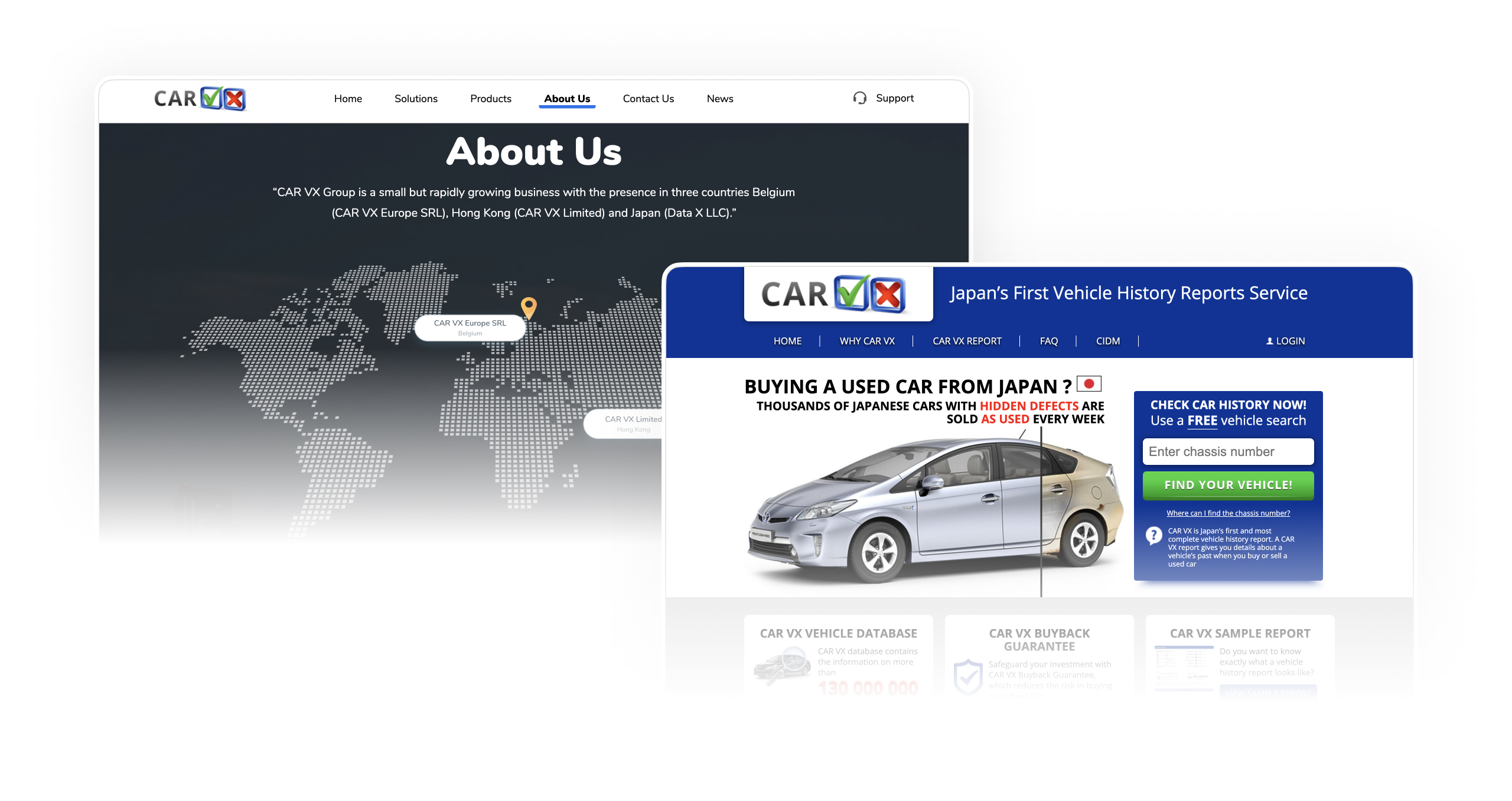
Company websites with the old logo
→ Requirements and Goals
A more unified and modern design was required to unite the company's various solutions under one brand. There were certain time restrictions, as our main focus was on a new web service. My task was to conduct a comprehensive analysis, propose a design that meets all requirements, ensure visual flexibility, and prepare all source files and graphics assets.
→ Research & Insights
I started by figuring out what the first impression the logo makes. This discussion with my customers helped me identify problems and shortcomings, as well as potential opportunities for improvement.
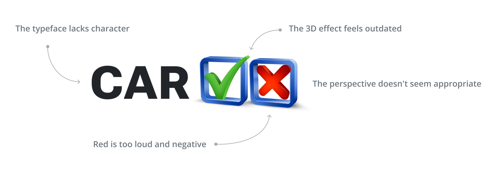
Original logo designed by me back in 2013
Customers didn't like the outdated 3D effect, perspective angle and lack of character in the typography. We agreed to optimize the primary colors (blue, green, and dark gray) and eventually update all the company's products and websites accordingly.
→ Process
I started brainstorming ideas and doodling. The goal was to come up with multiple concepts that we could discuss and elaborate on the next steps. I expected that those drafts will help me identify details that my clients would like/dislike and eventually will push the process further.
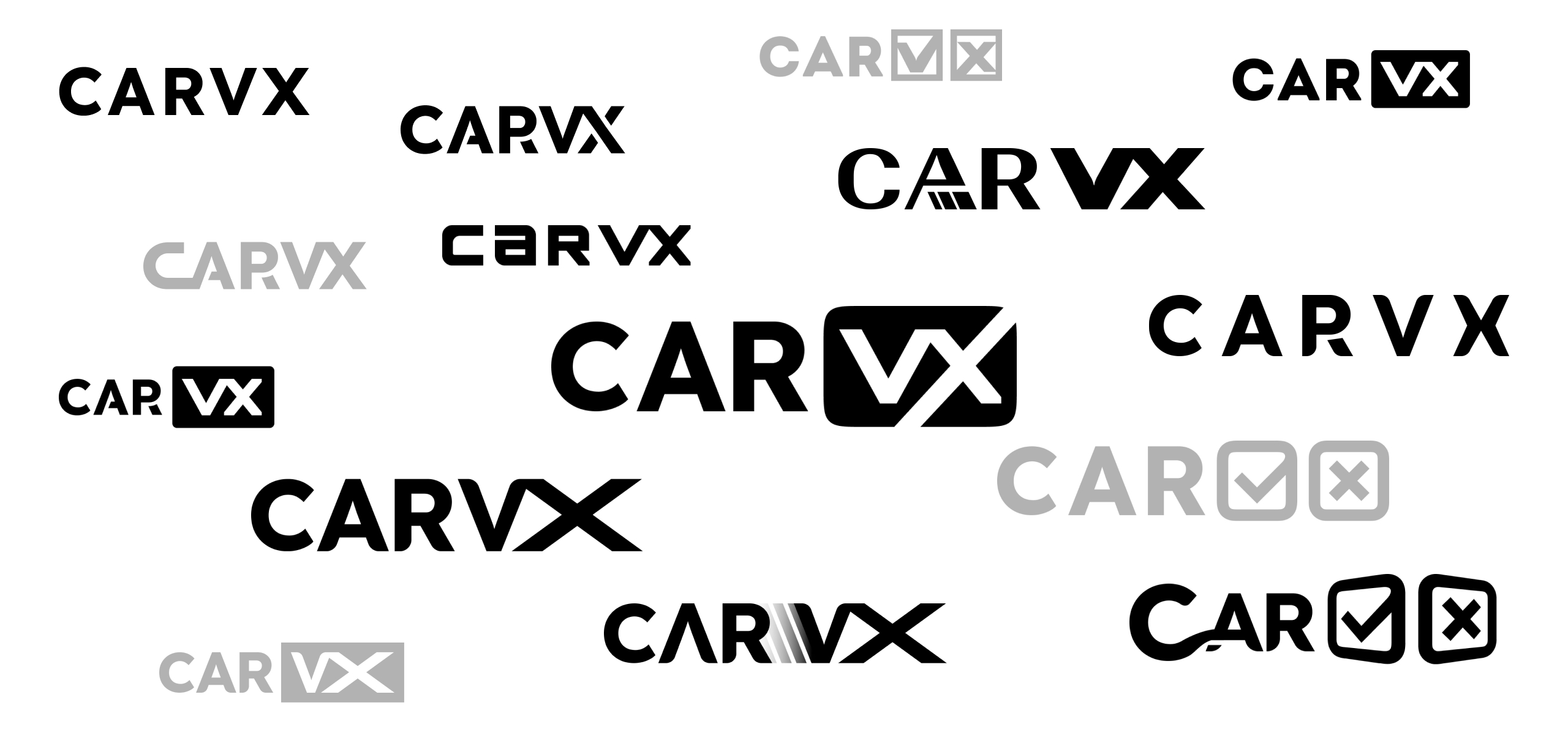
Some of the very first drafts I made
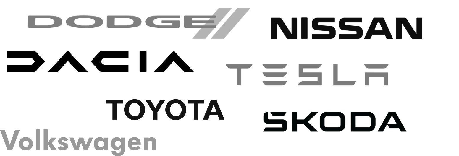
During the first round of discussion it was mentioned that despite the downsides, the original logo had become easily recognizable, so we decided to keep the checkmark metaphor (it also fits the Vehicle History Reports concept). We also agreed to keep a simple, geometric font, and I suggested drawing inspiration from automobile brands.
several sources of inspiration
Taking into account a significant budget constraint (the font must be under the Open Font License or similar), I have prepared several draft options.
After another round of discussions we settled on Zen Dots font (designed by Yoshimichi Ohira). Its grotesque and geometric shapes were great, but overall I thought it lacked visual weight and thickness, as I wanted the logo to appear more solid. In addition, I wanted to style the lettering as a monospaced font, giving the characters more stability and visual weight. I decided to take this font as a basis and create custom lettering from scratch.
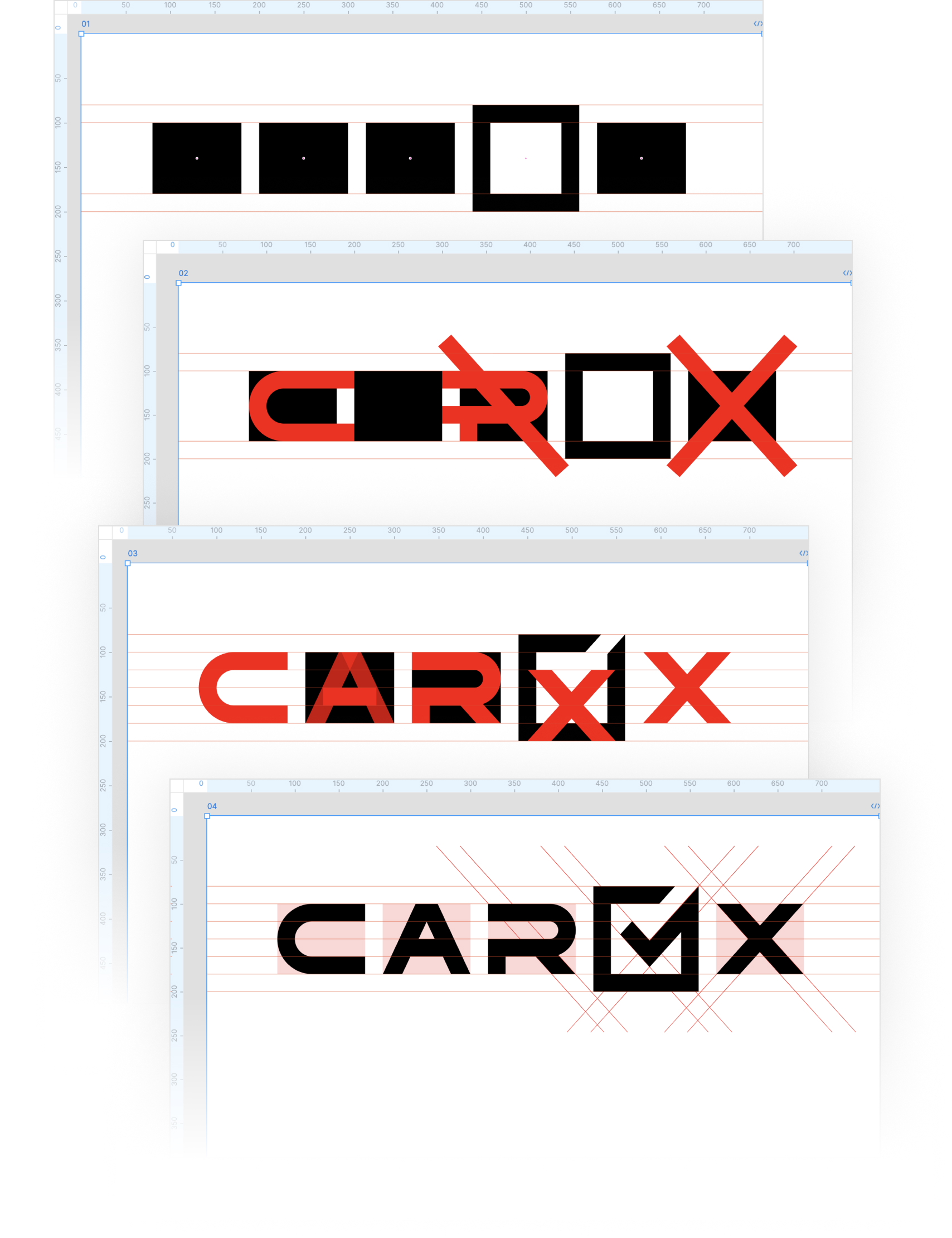
Logo construction process
I kept the checkmark metaphor, simplified the colors and visuals, and made the logo feel more "stable and reliable". The result met all the stated requirements, and the customers were satisfied.
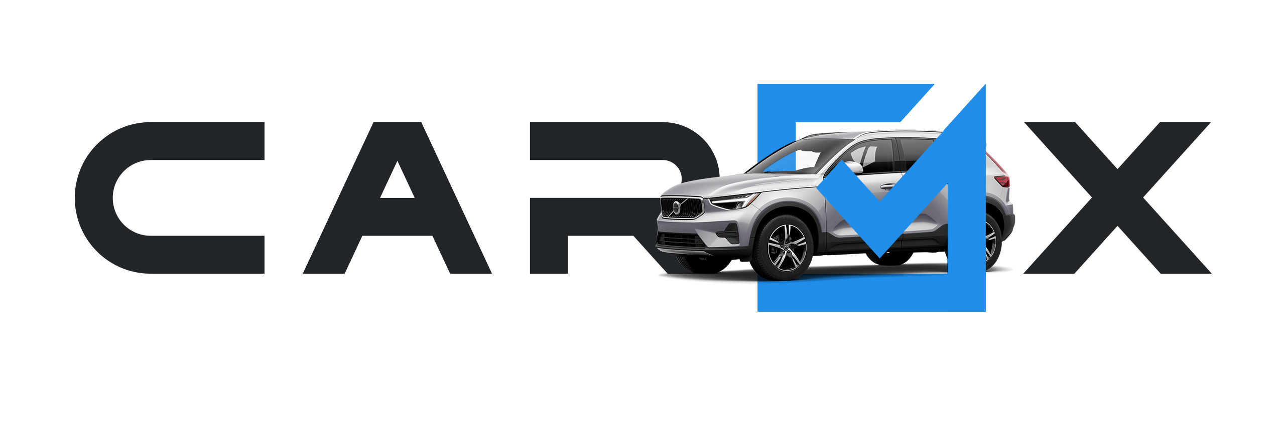
The final version
→ Outcomes
With limited time and relying on the trust of my clients, I was able to redesign the logo and fulfill all the requirements. The new version is modern, simple, and flexible, reflecting the essence of the company's business: trust based on verification and validation.
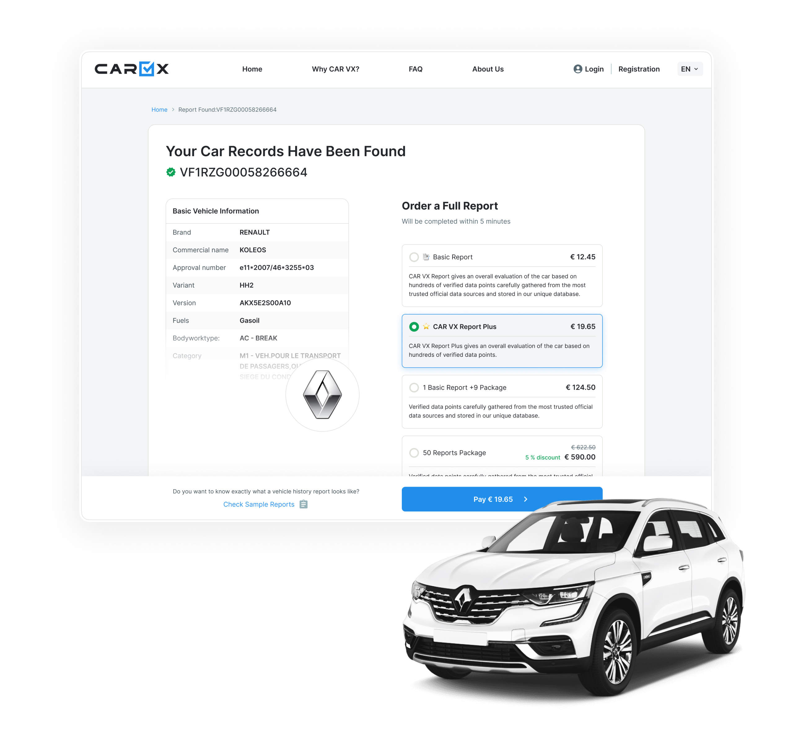
Please take a look at the snapshots of the interfaces that I've also worked on, and see how the new logo fits perfectly.